Shaders
Shaders modify the “normal” look of a widget eg. by only showing a certain part of it or changing the color. Different widgets have different shaders available.
To add a shader simply select the shader property and pick the shader you want to use. Currently only one shader per widget can be used.
Segment
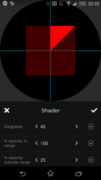
 The segment shader divides a widget into two parts based on a circle segment. The segment always starts at 0 degrees and ends at the given degree.
The opacity of the widget in and outside the segment can be specified.
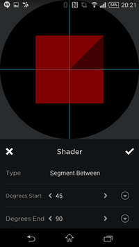
Segment Between
 This shader is very similar to the Segment shader above. The only difference is that you may specify the start angle as well.
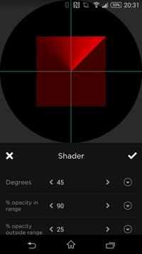
Radar
 Again similar to the Segment shader but will have a “shadow” following the segment creating a Radar effect.
HSV
The RGB shader let's you modify the color of a widget by specifying Hue, Saturation and Colorvalue adjustments.
RGB
The RGB shader let's you modify the Red/Green/Blue channels of the widget. Each channel accepts a value between -100 and 100.
Using a -100 disables that channel completely. Eg. a red shape (#ff0000) would be black when the red channel is adjusted to -100. Whereas a black shape (#000000) would turn red when the red channel is adjusted to 100.
Each channel accepts a complex expression as well which allows you to dynamically adjust colors based on tags.
