This is an old revision of the document!
Icon Sprites
Sprites are very similar to image widgets, so please refer to them for their general use.
The difference is that a sprite contains multiple icons in a single image. How the icons are aligned in the image is defined by the Image Grid property. The following sizes are supported: 2×2, 3×2, 3×3,4×3, 4×4, and 5×5. This means up to 25 icons can be in a single sprite.
Which of the icons is displayed determined by Image Selection property. It usually contains a lua expression mapping some tag to a number. Numbers are assigned to the grid positions starting in the top left corner (being 1) and then being incremented from left to right, top to bottom.
Eg. for a 3×3 grid the icons are numbered as follows:
| 1 | 2 | 3 |
| 4 | 5 | 6 |
| 7 | 8 | 9 |
Please note that custom sprites can not be added directly. Instead you have to pick one of the sub widgets below and then customize their expression and pick a custom image in the Custom Image dialog.
Weather
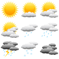
 Watchmaker comes with 4 different sets of Weather icons. They all feature a 3×3 grid with the following icons:
- sunny
- light rain
- heavy rain
- thunderstorm
- snow
- cloudy
By default the weather widget shows the current weather condition as provided by the weather provider using the following expression:
'{wci}' == '01d' and 1 or '{wci}' == '02d' and 2 or '{wci}' == '03d' and 3 or '{wci}' == '04d' and 4 or '{wci}' == '09d' and 5 or '{wci}' == '10d' and 6 or '{wci}' == '11d' and 7 or '{wci}' == '13d' and 8 or '{wci}' == '50d' and 9 or 1
{wci} of course refers to the weather tag containing the current weather icon information. The expression maps the many states this tag can have to the 9 available icons. Replace it with the appropriate tag to change the icon to a forecast day's weather condition.
{wci} can have the following values:
| Value | Condition |
|---|---|
 |  |
