Table of Contents
Icon Sprites
Sprites are very similar to image widgets, so please refer to them for their general use.
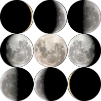
The difference is that a sprite contains multiple icons in a single image. How the icons are aligned in the image is defined by the Image Grid property. The following sizes are supported: 2×2, 3×2, 3×3,4×3, 4×4, and 5×5. This means up to 25 icons can be in a single sprite.
Which of the icons is displayed determined by Image Selection property. It usually contains a lua expression mapping some tag to a number. Numbers are assigned to the grid positions starting in the top left corner (being 1) and then being incremented from left to right, top to bottom.
Eg. for a 3×3 grid the icons are numbered as follows:
| 1 | 2 | 3 |
| 4 | 5 | 6 |
| 7 | 8 | 9 |
Please note that custom sprites can not be added directly. Instead you have to pick one of the sub widgets below and then customize their expression and pick a custom image in the Custom Image dialog.
Weather
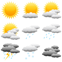
 Watchmaker comes with 4 different sets of Weather icons. They all feature a 3×3 grid with the following icons:
- Sunny
- Partly Cloudy
- Scattered Clouds
- Mostly Cloudy
- Light Rain
- Heavy Rain
- Thunderstorm
- Snow
- Mist/Fog
By default the weather widget shows the current weather condition as provided by the weather provider using the following expression:
- Image Selection
'{wci}' == '01d' and 1 or '{wci}' == '02d' and 2 or '{wci}' == '03d' and 3 or '{wci}' == '04d' and 4 or '{wci}' == '09d' and 5 or '{wci}' == '10d' and 6 or '{wci}' == '11d' and 7 or '{wci}' == '13d' and 8 or '{wci}' == '50d' and 9 or 1
{wci} of course refers to the weather tag containing the current weather icon information. The expression maps the many states this tag can have to the 9 available icons. Replace it with the appropriate tag to change the icon to a forecast day's weather condition.
{wci} can have the following values:
| {wci} value | {wct} text |
|---|---|
| 01d | Clear or Sunny |
| 02d | Windy or Cloudy |
| 03d | Mostly Cloudy |
| 04d | Clouds or Partly Cloudy |
| 09d | Breezy or Rain or Showers |
| 10d | Rain |
| 11d | Thunderstorm |
| 13d | Snow or Blowing Snow |
| 50d | Fog |
{wct} may show different descriptions depending on your weather provider.
Battery
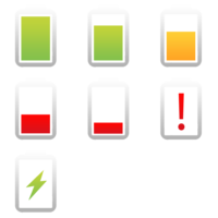
 The Battery display the current battery level as an icon. Depending on the image set chosen, the widget can display the level in different degrees of accuracy.
When adding the widget you can switch between the watch's and the phone's battery level to be displayed.
The default expression for the 7-icon set “Battery Set 3” is this:
- Image Selection
'{bc}' == 'Charging' and 7 or {bl} >= 90 and 1 or {bl} >= 70 and 2 or {bl} >= 50 and 3 or {bl} >= 30 and 4 or {bl} >= 10 and 5 or 6
See also Analog Battery Meters
WiFi Strength
The WiFi strength shows how good the WiFi connection of your phone currently is. Depending on the image set chosen, the widget can display the level in different degrees of accuracy.

